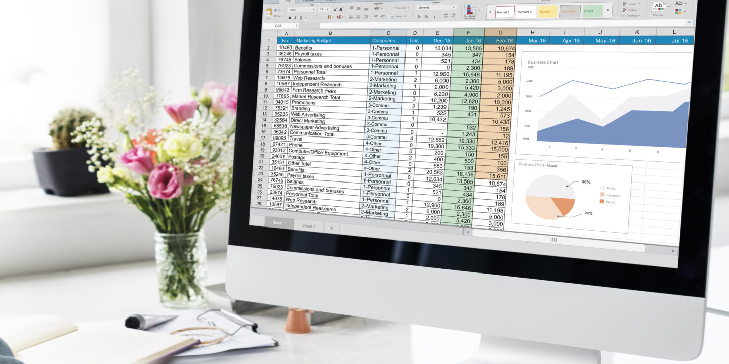
Data visualisation is a powerful tool that enables us to visually depict complex data, making it easier to grasp and interpret. Tableau, a dynamic platform that offers a wide range of functions for creating interactive and shared dashboards, is one of the leading tools in this market. Tableau can meet your visualisation demands whether you’re a novice or an expert data analyst. We’ll walk you through the steps to get started with Tableau and build attractive visuals in this guide.
The ability to view and comprehend large amounts of data is critical in today’s data-driven environment. Tableau, a renowned data visualisation tool that has altered the way corporations, researchers, and data aficionados obtain insights from their data, comes into play. Tableau has emerged as a game changer in the field of data visualisation, thanks to its user-friendly design and robust analytical capabilities. In this introduction, we’ll look at what Tableau is, why it’s important, and why it’s become a must-have tool for many.
Introduction to Tableau
Tableau is a data visualisation program that uses visual representation to transform raw data into useful insights. It supports a wide range of data sources, from Excel spreadsheets to cloud-based databases, and features a drag-and-drop interface that makes it easy to use even for users with no technical expertise.
What is Tableau?
Tableau is cutting-edge data visualisation software that transforms raw, unprocessed data into interactive and visually appealing dashboards and reports. Tableau, founded in 2003, has been at the vanguard of the data visualisation movement since then, catering to a diverse spectrum of industries and consumers, from business executives to data scientists.
Tableau is web-based software that assists researchers in transforming data into actionable and effective insights. It can connect to any type of data, regardless of where it is stored or the format in which it is saved. When you need to quickly do critical analytics on your data to identify latent opportunities, Tableau is really useful. Tableau’s sophisticated and improved visual analytics allow researchers to drag and drop data to build interactive dashboards. It will also allow you to share your research findings with everyone and leave an impression on the minds of the ultimate committee examining your research findings. Tableau is one of the greatest data visualisation applications utilised by academics due to its superior features.
Why Choose Tableau?
Intuitive Interface: Tableau’s interface is designed for ease of use. Its drag-and-drop functionality allows users to create visualisations without writing a single line of code.
Powerful Analytics: Beyond basic charts, Tableau offers advanced analytical tools like trend lines, forecasts, and clustering.
Interactive Dashboards: Tableau dashboards are interactive, allowing users to drill down into specifics and view data from different angles.
Collaboration and Sharing: With its Server or Online, teams can collaborate on dashboards, share insights, and make data-driven decisions collectively.
Choose the Appropriate Visual Elements
You must choose the proper graphic elements for your data visualisation reports if you want them to look appealing. Remember that one size does not fit all, and that different types of data require distinct graphic elements for effective display. It assists you in selecting from a wide range of visual elements. When comparing several categories, large charts are more useful and effective, while bullet charts are better at presenting progress reports towards a defined target.
Layouts Using Predictable Patterns
Have you ever considered that humans are more drawn to visual charts than they are to written text? Because people are visual creatures, they are naturally drawn to information presented to them in the form of visual elements. Use attractive and appealing maps, charts, and graphs in your academic papers to draw attention to your data reports. If you use various visual elements in your papers, be sure they are all consistent. It is a data visualisation platform, will assist you in reaching this goal.
Step-by-Step Guide to Using Tableau for Data Visualisation
- Installation and Setup
- Download Tableau Desktop from the official website.
- Install the software and sign in using your credentials.
- Upon launching, you’ll be greeted with the start page where you can connect to a data source.
- Connect to Your Data
- Choose the data source you want to connect to (e.g., Excel, SQL Server).
- Navigate to the file or server location and connect.
- Once connected, you’ll see a preview of your data in the “Data Source” tab.
- Prepare Your Data
- Drag and drop tables or columns to the canvas.
- Use the “Data Pane” to rename fields, create calculated fields, or group data.
- Ensure data quality by cleaning and filtering out unnecessary information.
- Create Your First Visualisation
- Navigate to a new worksheet.
- Drag and drop dimensions and measures to the rows and columns shelves.
- Choose a chart type from the “Show Me” panel.
- Customize the visualisation by adding colors, labels, and tooltips.
- Design Interactive Dashboards
- Combine multiple visualisations into a dashboard.
- Add filters, drop-down lists, or sliders to make the dashboard interactive.
- Arrange items in a layout that tells a coherent data story.
- Share Your Insights
- Publish your dashboard to Tableau Server or Tableau Online.
- Share the link with stakeholders or embed it on a website.
- Collaborate with team members by adding comments or annotations.
It has transformed how businesses visualize and interpret data. Many organizations like it because of its user-friendly interface and sophisticated analytical tools. You’ll be well on your way to harnessing the power of it to transform raw data into useful insights if you follow this step-by-step guide. Tableau provides the tools and flexibility you need to make the most of your data, whether you’re presenting to stakeholders, making strategic decisions, or simply examining data for insights.
Wrapping Up
In today’s data-driven environment, tools like it are no longer a luxury but a necessity. It enables individuals and businesses to understand their data, draw meaningful conclusions, and make sound decisions. It has the tools and capabilities to fulfill your goals, whether you’re a corporation looking to gain a competitive edge, a researcher hoping to present your findings compellingly, or a curious individual eager to explore the world of data. As data continues to play an increasingly important part in our lives, knowledge of tools like it will definitely be in high demand in the coming years.


